March 18, 2016
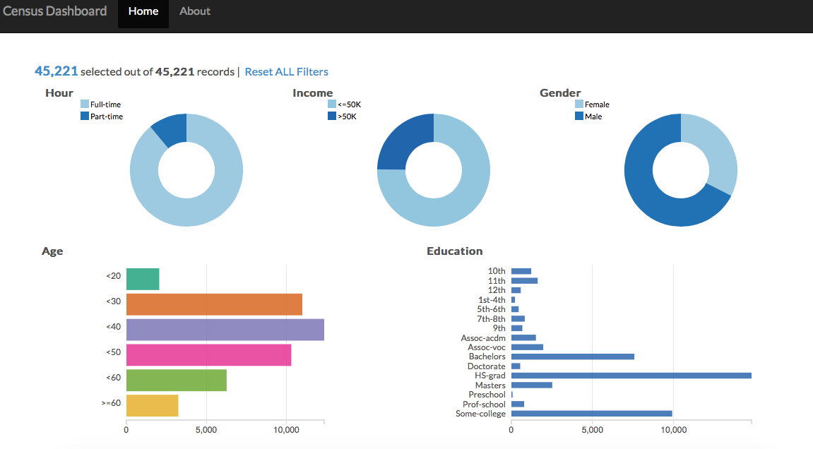
In this post, I discuss the results of the work from the first post. That first post was a bit lengthy and went into the details of getting the PostgreSQL set up, but that was all necessary to be able to query the data to set up the dashboard (a screenshot is shown below, you can click on multiple things at once...cross filter charts)!
Problem Statement
So the goal of the project was to see if census data could be used in an interesting manner. While discussing possible problems that could be solved, our team figured that it would be interesting to use the data as if we had just acquired a freelance employment company. Let me make this more clear:
- The parent company (a job posting company, think Monster.com), had just acquired a freelance job posting company (they have many freelance, gig type job postings)
- The parent company has a database of existing users but because it was not focused on freelance and gig type jobs, the database does not have hours worked per week as a feature for its users
- Machine learning would be used to predict how many hours an individual works (we bucketed this into < 40 hours or >= 40 hours)
- Ultimately, in the hypothetical world, we would then target individuals that (we predicted) worked < 40 hours with the part-time job postings (from the acquired company)
After the prediction, was the visualization aspect that would help our hypothetical company's managers to slice and dice data as they wanted.
Approach
As part of the problem, I wanted to use PostgreSQL to get used to using it in a remote environment so that I could learn to store my data remotely (hence the previous post). However, the next step was to get the data out of the database so that it could be manipulated and massaged for further analysis.
For this, Psycopg2 was the best tool as it allowed for a pretty straight forward way to connect with the remote database. I wrote a Python script so that anyone on my team could quickly enter their login details and the script would ask for the SQL query. Then, the output would be a pandas dataframe of the data that was requested.
# input must be strings
def query_database(user, dbname, password, host, port):
    '''
    dbname: database name
    user: username
    password: password for the user
    host: public dns
    port: typically for postgresql 5432
    returns a pandas dataframe of the given query
    '''

    try:
        # Create connection with database
        conn = psycopg2.connect("dbname="+dbname+" user="+user+" password="+password+" host="+host+" port="+port)
        print "Connected"
        cur = conn.cursor()

        # Ask for user's SQL query
        print "Query please: "
        input_query = raw_input()

        # Execute search query
        cur.execute(input_query)
        data = cur.fetchall()

        # Return dataframe
        df = pd.DataFrame(data)
        cur.close()
        conn.close()

        return df

    except:
        print "Connection error or query mistake"
This made it quite easy to get the data out of the AWS database. The next steps was to clean the data and then run models to predict the hours worked.
In terms of cleaning the data, I wrote a function that took as input the previously outputted dataframe and returned a cleaned dataframe with white spaces removed from column headers, hours per week worked turned into a binary variable (< 40 hours worked or >= 40 hours worked), and other categorical variables turned into dummy variable columns.
Predictions
For the next step, we used the cleaned data as input to a couple different classification models. In order to test our models' accuracy we used 3 fold cross validation and achieved an accuracy score of ~70%. We could have used other error metrics but in our case we felt like the model was performing as good as we would have expected (we actually averaged couple models to achieve this accuracy).
Given the business problem, we were okay with 70% because for our hypothetical company, any classification of < 40 hours worked (part-time) would mean that those individuals now had a lot of new job postings to browse (we acquired a freelance/ gig job posting company). Therefore, any exposure to these job postings would be better than nothing at all. Of course, in reality as we begin to get responses to the part-time job postings we would refine the prediction to make sure that we aren't showing part-time jobs to individuals who are actually working full-time (false positives).
Dashboard
The dashboard. Oh man. Okay, so a big part of this project was to practice using D3. Honestly, I had seen D3 used before, but I had no idea how flexible it was and how cool it was (the ease of use is something else). So I was quite excited to get my hands dirty.
The great thing about making dashboards is that there are lots of examples to draw from. For this particular dashboard, I used an example that Sara Quigley had made.
By the end, the resulting dashboard was quite different and I felt like I got to experiment with quite a lot of different techniques. (as an aside: I am thankful for templates and also think that if possible you should make use of resources that are available, but make sure you know what is actually happening when you change things!)
I spent a lot of time reading through the code to try to understand how cross filter objects were being created and used. By the end, I had taken out a couple charts and also added a few items to the dashboard so that it fit out business problem
Also reading documentation is probably one of the best ways to learn so I did a lot of that.
Summary
Overall, this project was quite interesting in that it had multiple moving parts that came together as a single dashboard deliverable. The awesome thing about this project was that it was pretty open ended so the problem statement that we came up with actually seemed like a real problem.
I spent most of my time on setting up the database, writing the script to pull data out, and tweaking/customizing the dashboard. In terms of takeaways, I realized that visualization is a large aspect of data science because the communication of results is vital to any problem. More specifically, a visually appealing tool can really help tell an impactful story (of course, the tool has to make sense).
Working with PostgreSQL and D3 helped me understand a more complete picture of the analytics space than just using Python. Moving forward, I would like to continue expanding my knowledge in these technologies and more!